
Page 146 - 20dynamics of cancer
P. 146
THEORY II 131
9
Acceleration 5 s = 0.6
7
3
1
30 40 50 60 70 80
Age
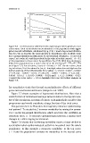
Figure 7.8 Acceleration for different levels of phenotypic heterogeneity in tran-
sition rates. Each curve shows the acceleration in the population when aggre-
gated over all individuals, calculated by Eq. (7.9). I used a log-normal distribu-
tion for f(u) to describe the heterogeneity in transitions rates, in which ln(u)
has a normal distribution with mean m and standard deviation s. To get each
curve, I set a value of s and then solved for the value of m that caused 1−b = 0.1
of the population to have cancer by age 80 (see Eq. (7.7)). With this calculation,
95% of the population has u values that lie in the interval (e m−1.96s ,e m+1.96s )
7
(see Figure 7.7). For all curves, I used n = 10 and L = 10 . For the curves, from
top to bottom, I list the values for (m, s) : low–high, where low and high are the
bottom and top of the 95% intervals for u values: (−4.64, 0) :0.0097 − 0.0097;
(−4.77, 0.2) :0.0057 − 0.013; (−5.00, 0.4) :0.0031 − 0.0015; (−5.25, 0.6) :
0.0016−0.017; (−5.50, 0.8) :0.00085−0.020; and (−5.75, 1) :0.00045−0.023.
I tagged the curve with s = 0.6 to highlight that case for further analysis in
Figure 7.9.
for quantitative traits that depend on multiplicative effects of different
genes and environmental factors (Limpert et al. 2001).
Figure 7.7 shows examples of log-normal distributions. Note that a
small fraction of individuals has large values relative to the typical mem-
ber of the population. In terms of cancer, such individuals would be fast
progressors and would contribute a large fraction of the total cases.
The question here is: How does heterogeneity influence epidemiolog-
ical pattern? To study this, I increase variability by raising the param-
eter s in the log-normal distribution, which increases the variability in
transition rates, u. To measure epidemiological pattern, I analyze how
changes in s affect log-log acceleration.
Figure 7.8 shows that increasing variability causes a large decline in
acceleration when epidemiological pattern is measured over the whole
population. In this example, s measures variability: in the top curve,
s = 0 and the population contains no variability; in the second curve