
Page 147 - 20dynamics of cancer
P. 147
132 CHAPTER 7
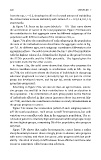
from the top, s = 0.2, showing the effect of a small amount of variability;
the curves below increase variability with values of s = 0.4, 0.6, 0.8, 1.0,
respectively.
In Figure 7.8, focus on the curve labeled s = 0.6. That curve shows
the acceleration of cancer in the total population. Figure 7.9 illustrates
the contribution to that aggregate curve by different subgroups of the
population with different values of the transition rate, u.
Figure 7.9a plots the contribution of each subgroup in the population:
the sum of the individual curves determines the aggregate curve in Fig-
ure 7.8. At different ages, each subgroup contributes differently to the
aggregate pattern. The solid curve shows the top 2.5% of the population
with the highest values of u, defined in the legend as the group between
the 97.5th percentile and the 100th percentile. The legend gives the
percentile levels for the other curves.
In Figure 7.9a, the solid curve shows that those who progress the
fastest contribute most strongly to acceleration early in life. In Fig-
ure 7.9b, the solid curve shows the fraction of individuals in that group
who have progressed to cancer; already by age 30, ten percent of that
group has developed cancer, and by age 60, nearly everyone in that
group has progressed.
Returning to Figure 7.8a, we can see that, as age increases, succes-
sive groups rise and fall in their contributions to total acceleration in
the population. The contribution of each group peaks as the fraction
of individuals affected in that group increases above ten percent (Fig-
ure 7.9b), and then the contribution declines as nearly all individuals in
the group progress to cancer.
Figure 7.9c shows the acceleration pattern if each subgroup were it-
self the total population. Each group is itself heterogeneous, but with
variation over a smaller scale than in the aggregate population. The ac-
celeration pattern is relatively high and constant within all groups except
the two highest groups, comprising 5% of the population, who progress
very fast.
Figure 7.9b shows that under heterogeneity, cancer forms a rather
sharp boundary between those strongly prone to disease, who progress
with near certainty, and those less prone, who progress with low prob-
ability. This kind of sharp cutoff between those affected and those who
escape is sometimes called truncation selection.