Page 65 - Graphic Design and Print Production Fundamentals
P. 65
Graphic Design 53
            Block, Gothic, Fraktur, or Old English. The look of this font category is heavy and dark. The letterforms
            are often condensed and put together tightly in a text block creating a dark colour (tone) for a page —
            between 70% and 80% grey. To put the tone in context, the usual tone of a modern text page is between
            55% and 70% grey. The look of the letterforms makes it hard to read the page, because legibility was not
            their first function as it is today. The beauty of the font and the form of the book was the primary goal
            for early publications. Books were considered to be objects of wealth and beauty, not solely as a means
            to convey information.


                                                          Humanist


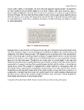
                                        Figure 3.11 Example of Humanist type


            Humanist fonts are also referred to as Venetian, because they were developed in and around Venice in the
            mid-15th century (see Figure 3.11). Their design was modelled on the lighter, open serif letterforms and
            calligraphy of the Italian humanist writers. The designers strove to replicate many of the characteristics
            found in this writing style, including multiple variations of a glyph (letterform) that a written document
            possessed. For instance, a font could have up to 10 different lowercase a’s to set a page with. Humanist
            types were the first roman types. Though they were much easier to read and lighter on the page than
            blackletter, they still created a visually dark and heavy text block in contrast to the fonts we have become
            accustomed to. Humanist fonts have little contrast between the thick and thin strokes — the strokes are
            usually heavy overall. The x-height of a humanist font is small compared to contemporary fonts, and
            this impedes quick comprehension and legibility. Humanist fonts are not often used for these reasons,
            though they are well respected because they are the original model so many other fonts are based on. It
            is important to remember that these fonts were a perfect match to the earliest printing technologies and
            that those presses could not have printed our light and delicate fonts. Fonts have evolved alongside the
            technological advancements of the printing industry.

            Examples of humanist fonts include Jenson, Centaur, Verona, Lutetia, Jersey, and Lynton.

