Page 63 - Graphic Design and Print Production Fundamentals
P. 63
Graphic Design 51
            project. It can also tie one piece of design to another, or become a defining element of a brand or a series
            of communications.

            The tactile aspect of a design work comes into play with the choices we make for the substrate we
            print on. The surface can be smooth or rough, glossy or matte, thick or thin, translucent or opaque,
            paper, plastic, concrete, metal, wood, or cloth. Paper can even have two or more of these qualities
            if we augment the original look of the paper with layers of varnish that reverse the tactile effect of
            the substrate. Often the choice of substrate is most effective if it is sympathetic to or contrasts with
            the concept and content of the piece. The choice of substrate texture affects how the viewer perceives
            the content — both physically and optically. Glossy substrates often feel sophisticated, hard, and cold.
            They are imbued with a sense of precision because the ink sits on top of the surface of the paper and
            retains almost all of its original integrity. A textured matte paper feels organic, accessible, and warm
            because the ink is partially absorbed by the paper, and is therefore influenced by and fused to its softer
            characteristics.


            Pattern is part of the element of texture, but because of its special ability to hold content that is
            meaningful, and its long and significant cultural history, it deserves a special mention. All patterns can
            be reduced to dot and line and are organized by a grid system of some kind. Their ‘flavour’ is a reflection
            of the culture and time they come from and of the materials that created them. Patterns can be a subtle
            addition to the content of any design work. A pattern can be created using a relevant graphic (like a logo)
            or repeated multiple times, or it can support the organizational principles developed by the designer in a
            decorative way; for example, if a grid is based on the square and the texture of the pattern is also based
            on the square.


            When the pattern is seen as a whole, its individual components melt away and lose their identity to the
            larger field of the pattern. This ability to focus on a pattern in multiple ways creates a second purpose
            for the graphic element (such as a circle, a square, a logo, or symbol) the designer has used. In modern
            design practice, pattern is an opportunity to augment the clean and simple material surfaces we work
            with and ornament a page or a website with a relevant texture.


            Typography


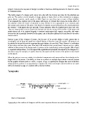
                 Figure 3.9 Typography


            Typography is the medium of designers and the most important element we work with (see Figure 3.9).

