Page 62 - Graphic Design and Print Production Fundamentals
P. 62
50 Chapter 3. Design Elements, Design Principles, and Compositional Organization


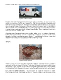
                                        Figure 3.7 FedEx express truck


            Designers often utilize figure/ground in the crafting of symbols, wordmarks, and logos because of its
            capacity to create meaning with the space surrounding a mark. An excellent example of figure/ground is
            the FedEx wordmark (see Figure 3.7). The negative space needed to define the letterforms also augments
            their meaning by creating a forward pointing arrow. In print design, negative space can also allude to
            what is outside the frame and makes the field of the page or poster larger that it physically is. On a static
            or moving screen, negative space has the ability to change the flow of time, to introduce a break, or to
            create space around an important point.

            Composing strong figure/ground tension is an excellent skill to acquire for designers of any media.
            Crafting white space eventually becomes as important to a designer as selecting the words and the
            elements of a project. Composing the negative spaces of a composition will allow you to vary visual
            emphasis of the elements, and control and increase the visual energy overall.


            Texture


                                        Figure 3.8 Example of texture


            Texture is a visual and a tactile quality that designers work with (see Figure 3.8). Texture is used both in
            composition and also on the printed substrate or media space. Designers create textures for their projects
            with anything at hand. A texture can be made with typography, generated in raster or vector software
            like Photoshop or Adobe Illustrator, or by using a camera and capturing elements in the material world.

            Using texture thoughtfully will enhance a visual experience and amplify the context for the content.
            Often adding texture adds visual complexity and a bit of visceral depth to a two-dimensional design

