Page 60 - Graphic Design and Print Production Fundamentals
P. 60
48 Chapter 3. Design Elements, Design Principles, and Compositional Organization
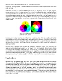
            Figure 3.5). This light system is called additive because the three primaries together create all the hues
            in the spectrum.

            Subtractive colour is the system needed for print media, and its primary colours are cyan, magenta,
            yellow, and black (CMYK), as shown in Figure 3.5. In CMYK, the absence of colour equals white, while
            combining all colours creates black. Both of these systems have many overlapping colours but their
            colour spheres are not exactly the same. Understanding where the overlaps e xist and where they don’t
            correspond is vital to the success of a project. If your print materials cannot be replicated on screen, you
            will have a major design problem that will have to be corrected. Always choose colours that will work
            in both systems.


                                        Figure 3.5 Primary colours for the additive and
                                        subtractive colour schemes


            Environment is another aspect of colour choice that is very important. Both the natural world and the
            world within the screen vary from moment to moment and screen to screen. Colours are affected and
            influenced by the amount of atmospheric light available to them as well as by the colours in contact with
            the object they are viewing. Texture also changes our perception of a colour as does the brightness or
            darkness around it.

            However much a designer hopes to define the parameters of a colour palette, there will always be
            unknown factors influencing the palette on the viewers’ end. Create a palette that is focused enough
            to create the right atmosphere and energy level for your project, but one that doesn’t rely too heavily
            on a specific colour. Careful, considered colour use will help define a message and create a mood that
            supports the composition and concept of a design work. Always create a palette that will work with both
            colour systems and also be robust enough to work in less than optimal environmental circumstances.


            Negative Space


            Negative space, which is also called white space, is the visually quiet area that surrounds the active area
            of a composition (see Figure 3.6). It is also referred to as figure/ground, and has a very important role in
            composition as it shapes the visual perception of the subject. Without negative space, there is no positive
            space — the effect is similar to seeing a polar bear in a snowstorm. Negative space is often thought of as
            as passive and unimportant, but the active elements or ‘figure’ are always perceived in relation to their
            surroundings by the mind of the viewer. The composition of the negative space frames and presents the
            active elements in a flat or dynamic way. If the surrounding area is busy with many other elements, the
            focal point loses its power because the elements all have a similar visual value. The works of Gustav
            Klimt exhibit this quality.

