Page 82 - Graphic Design and Print Production Fundamentals
P. 82
70 Chapter 3. Design Elements, Design Principles, and Compositional Organization


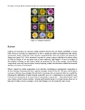
                                             Figure 3.27 Example of repetition


            Balance


            Balance and symmetry are important design qualities because they are deeply embedded in human
            DNA. Because our bodies are symmetrical, we have a strong association and satisfaction with centred,
            symmetrical design. Balancing visual elements compositionally calms the tensions and grounds the
            design (see Figure 3.28). This is important if you wish to convey a sense of stability to the viewer. When
            we look at a design, we use our innate sense of what constitutes ‘right balance’ to assess its stability. If
            that stability is missing, we feel tension, which can counteract the core of the message. Centred design
            compositions work very well for stable, security-inspiring content, but what about content that demands
            attention, or tension, or excitement?

            When a centred (or stable) composition is not desirable, developing an asymmetrical composition is
            the best strategy. Asymmetry has been explored in graphic design for the last 150 years, and designers
            continue to discover new strategies that feel fresh. Asymmetry has no empirical rules but is guided by
            balancing the distribution of main elements around the space of a composition in an unexpected way.
            Contrast and counterpoint are the main tools of composition in asymmetry — large shapes balance small
            ones; intense colours balance neutrals. Creating asymmetrical design is not easy because there are no
            firm rules to follow, but it is exciting to create and exciting to see for exactly the same reason.

