
Page 90 - Health Literacy, eHealth, and Communication: Putting the Consumer First: Workshop Summary
P. 90
Health Literacy, eHealth, and Communication: Putting the Consumer First: Workshop Summary
eMeRGinG tooLS AnD StRAteGieS
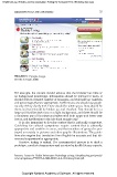
FIguRE 5-1 Simple design.
SOURCE: Brach, 2008.
Figure 5-1, bitmapped
For example, the content should assume that the browser has little or
no background knowledge, information should be relevant to users, it
should deliver a limited number of messages, and it should use numbers
and percentages that are appropriate. Furthermore, one should use graph-
ics only if they clarify text. There should be white space, lines should be
short, and text should be broken up and chunked. Text should be in a
large and familiar dark font on a light background, and there should be
a consistent use of font sizes and styles with both upper and lower case
letters, and justification to the left-hand margin only.
It is also important to develop content that is culturally competent.
Guidelines for cultural competence require content that is culturally
appropriate and sensitive to users, and that members of groups be por-
trayed accurately in pictures and other graphic illustrations. The guide-
lines also require that translation from English be accurate and that idi-
oms and expressions be appropriate.
Iterative testing is critical. The recommended process is to draft a
prototype, conduct a team review and a review by health-literacy experts,
Resource Center for Health Information Technology at http://healthit.ahrq.gov/portal/
server.pt/gateway/PTARGS_0_3882_803031_0_0_18/LiteracyGuide.pdf.
Copyright National Academy of Sciences. All rights reserved.