Page 343 - 20dynamics of cancer
P. 343

328                                        APPENDIX: INCIDENCE

                                          %PP                 0YRK                'SPSR
                                     T !        VLS !      T !    VLS !        T !        VLS !

                                7))6   z


                                 z


                                    T !       VLS !        T !    VLS !        T !    VLS !

                                7))6   z


                                 z                                         z

                                    T !        VLS !        T !    VLS !          T !        VLS !
                                )RKPERH

                                 z


                                    T !        VLS !        T !    VLS !        T !        VLS !


                                7[IHIR

                                 z                    z                    z


                                    T !        VLS !        T !        VLS !        T !        VLS !

                                .ETER

                                 z


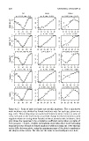
                              Figure A.13  Ratio of male to female age-specific incidence. The y axis shows
                              male incidence rate divided by female incidence rate for each age, given on a
                              log 2 scale. This scaling maps an equal male:female incidence ratio to a value of
                              zero; each unit on the scale means a two-fold change in relative incidence, with
                              negative values occurring when female incidence exceeds male incidence. Each
                              plot shows the Spearman’s rho correlation coefficient and p-value; a p-value of
                              zero means p< 0.0005. Positive correlations occur when there is an increasing
                              trend in the ratio of male to female incidence with increasing age. Note that the
                              scales differ between plots, using the maximum range of the data to emphasize
                              the shapes of the curves. The data are the same as used in Figures A.1–A.11.
   338   339   340   341   342   343   344   345   346   347   348