Page 219 - 20dynamics of cancer
P. 219

204                                                CHAPTER 10

                                          All                Heart               Cancer
                                                       4
                                    (a)                3  (d)              4  (g)
                                Death rate  3          2  1                3
                                  4

                                  2
                                   20             40      60       100  20             40      60       100  2  20             40      60       100

                                  0
                                  1  8  (b)            0  1  (e)           4  (h)
                                Acceleration  6  4     8  6                2  0


                                  2
                                                       2  4                −2
                                   20             40      60       100  0  20             40      60       100  20             40      60       100

                                Acceleration  8  6  4  (c)  1  8  6  (f)   4  2  0  (i)


                                  0  2                 4  2                −2
                                    20     40      60      80     100  20     40      60      80     100  20     40      60      80     100
                                                              Age


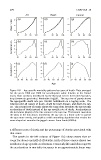
                              Figure 10.1  Age-specific mortality patterns by cause of death. Data averaged
                              for the years 1999 and 2000 for non-Hispanic white females in the United
                              States from statistics distributed by the National Center for Health Statistics,
                              http://www.cdc.gov/nchs/, Worktable Orig291. The top row of panels shows
                              the age-specific death rate per 100,000 individuals on a log-log scale. The
                              columns plot all causes of death, death by heart disease, and death by can-
                              cer. The second row of panels shows the same data, but plots the age-specific
                              acceleration of death instead of the age-specific rate of death. Acceleration is
                              the derivative (slope) of the rate curves in the top row. The bottom row takes
                              the plots in the row above, transforms the age axis to a linear scale to spread
                              the ages more evenly, and applies a mild smoothing algorithm that retains the
                              same shape but smooths the jagged curves. From Frank (2004a).


                              a different cause of death and the percentage of deaths associated with
                              that cause.
                                The panels in the left column of Figure 10.2 show causes that ac-
                              count for about one-half of all deaths. Each of those causes shares two
                              attributes of age-specific acceleration. From early life until about age 80,
                              the acceleration in mortality increases in an approximately linear way.
   214   215   216   217   218   219   220   221   222   223   224