Page 13 - LoudOffice_Guide-to-HTML_Part-II_Advanced.PDF
P. 13
Radio buttons are designed to force a website visitor to have to make a choice between a
               number of options.  Once any value within the set is selected, all others are automatically
               deselected.  The basic format of this tag is:
                                < i n p u t  t y p e = “ r a d i o ”  n a m e = ” . . . ”  v a l u e = ” . . . ” >
               Note that the n a m e  attribute must be the same for every choice within a set.  Like the check
               box, this input tag can also take a special attribute, c h e c k e d , that sets the default value of
               the selected radio item on.


               Combo Boxes
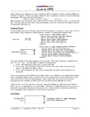
               Combo Boxes provide an efficient way for the Web Surfer to choose a value from a list of
               valid values. This is similar to Radio Buttons, except it is designed for larger lists.


               The basic format of the tag is slightly more complex.  The entire selector is declared with
               the < s e l e c t >  tag.  This tag takes a number of parameters:
                   Ø n a m e : this parameter allows you to name the field.
                   Ø m u l t i p l e : this parameter tells HTML that the user may select more than one
                       option.  This does not take a value
                   Ø s i z e : this designates the size of the combo box (in terms of the height) to be
                       displayed.

               As you can see above, by differing the value of the s i z e  attribute, you change the display
               from a dropdown where only one choice at a time is displayed to a select box where more
               than one item at a time can be displayed.  Also, notice that the m u l t i p l e  attribute
               changes the form element so that more than one item can be selected at a time.
               Inside of the < s e l e c t >  tag are < o p t i o n >  tags that display the options to be selected.
               Each < o p t i o n >  tag takes a v a l u e  attribute.  Whatever is displayed within the < o p t i o n >
               elements are actually displayed in the combo box, while whatever is declared within the
               v a l u e  attribute will be passed when the form is submitted.


               Text Area


               LoudOffice.com Guide to HTML – Part II                                               Page 13

