
Page 129 - Graphic Design and Print Production Fundamentals
P. 129
Graphic Design 117
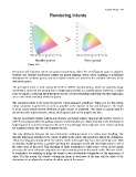
Figure 4.10
Perceptual and saturation intents use gamut compression, where the overall gamut space is adjusted.
Relative and absolute colorimetric intents use gamut clipping, where colour matching is maintained
throughout the available gamut, and out-of-gamut colours are moved to the available extremes of the
destination gamut.
The perceptual intent is used mainly for RGB to CMYK transformations, which are typically image
conversions. Since we are moving from a larger gamut (RGB) to a smaller gamut (CMYK), it makes
sense to employ a rendering intent that preserves the overall relationship rather than one that emphasizes
one-to-one colour matching within the gamut.
The saturation intent is the least relevant for colour-managed workflows. When you use this intent,
colour saturation is preserved as much as possible at the expense of hue and luminance. The result
is a bad colour match, but the vividness of pure colours is preserved. This intent is usually used for
documents such as presentations, charts, and diagrams, but not for graphic arts jobs.
The two colorimetric intents, relative and absolute, are closely related. They are both used for CMYK to
CMYK conversions where the gamuts of source and destination are closely matched or the destination is
larger (typical of a proofer compared to the press it is matching). They emphasize exact colour matching
for in-gamut colours and clip out-of-gamut colours.
The only difference between the two colorimetric rendering intents is in white point handling. The
absolute intent pays attention to the colour of white in the source and reproduces that in the destination.
Think of newspaper printing where the whitest colour is the paper that has a dull and beige tone. With
an absolute rendering intent, a proofer matching the newspaper would add that beige colour to all of
the white areas of the proof. This matching of white destination to white source colour is not usually
necessary due to the chromatic adaptation or colour constancy that we discussed earlier. We have a built-
in mechanism for adjusting to judge the overall colour relationship independent of the appearance of
white. For this reason, the relative colorimetric intent is used most of the time and the white of the
destination is not adjusted to simulate the white point of the source.